Semi-Autonomous Vehicle HMI

Making the switch between rider and machine safe and easy to read: a three-wheel electric moped with physical controls and a digital dashboard, designed for a rider with limited mobility. A team project in Interaction Design Fundamentals at Carnegie Mellon, Fall 2025.

Course
Interaction Design Fundamentals · Carnegie Mellon · Fall 2025
Team
3 designers
My role
Research & problem framing · Physical prototyping · Usability testing · Digital dashboard (low to high fidelity)
Deliverables
Physical control prototype · Dashboard flows · Design rationale

My role

I worked across the whole project with two teammates: framing the problem, building the physical controls, running usability tests, and designing the dashboard from low to high fidelity.

0 / 6participants found our original auto-mode control on their own
6usability-test participants close to our persona in age and ability
3rounds of dashboard fidelity: low, mid, high
4physical control groups: dashboard, control panel, two handles

Why this project matters

Semi-autonomy lives or dies at the handover: the moment the vehicle gives control back to a person, or takes it over.

This project was about making those moments safe and easy to read for a rider who can’t afford to be surprised.

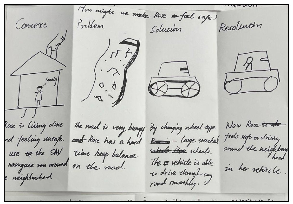
Hand-drawn storyboard in four panels: context, problem, solution, resolution. Rose struggles to keep her balance on a bumpy road; a different wheel setup lets her ride through her neighborhood safely.
Storyboard: bumpy roads make it hard for Rose to keep her balance; a different wheel setup lets her ride her neighborhood with confidence.

Designing for Rose

Our brief was a semi-autonomous electric vehicle for one persona: Rose, an older woman who has difficulty walking long distances and worries about her safety when riding.

Two questions guided everything: How might we make Rose feel safe and free while navigating her neighborhood? And how might we use physical and digital design to help her feel supported when an emergency happens?

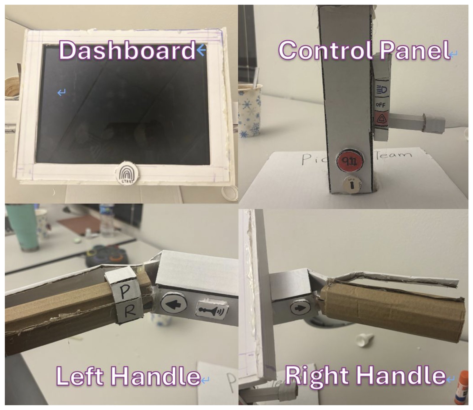
Physical prototype in four views: the dashboard with its screen and fingerprint Start button, the control panel with a red 911 button, the left handle with the gear ring, and the right handle with throttle and brake.
The physical prototype: dashboard, control panel, left handle, right handle.

Three wheels, and the critical controls you can touch

We chose a three-wheel electric moped, one wheel in front and two in back, so Rose can rest her legs while staying balanced and stable.

The controls that matter most live on the vehicle, not only on a screen: a Start button below the dashboard, a side panel for lights, hazard lights and a 911 call, and two handles with turn signals, throttle, brake, and a gear ring.

We also chose not to build a phone app: navigation and parking already live on the vehicle’s own screen.

Key decision 1: how do you turn on auto mode?

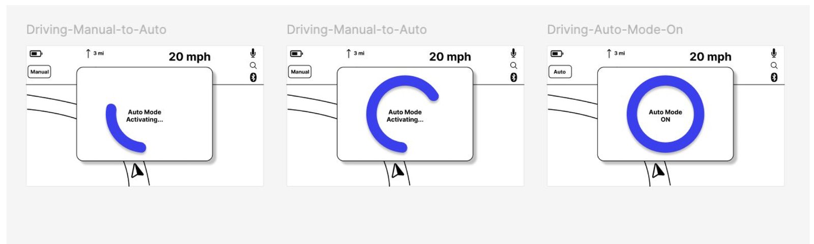
Our first design made auto mode hard to trigger by accident: the rider pressed and held two finger icons on the handlebar while a blue ring filled on screen.

Testing broke it. None of our six participants found the control on their own. The placement was awkward (a Fitts’s law problem), the icons showed that something could be pressed but not how to use it, and waiting for the ring to fill was a safety risk at exactly the moment a switch mattered.

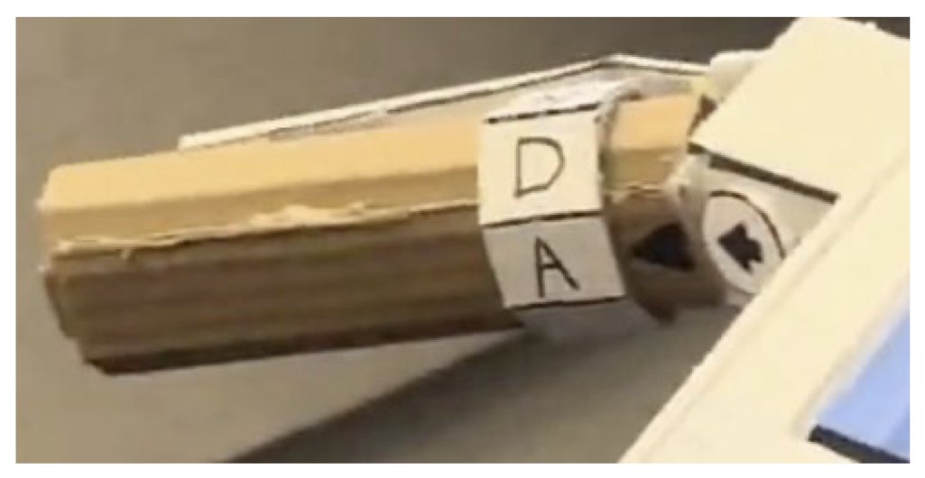
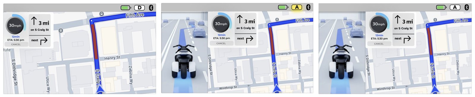
We replaced it with a gear ring on the left handle, with P, R, N, D and A positions, borrowing a pattern our riders already know: retired seniors who drive cars. Braking hands control back to the rider, and so does any obstacle the vehicle can’t avoid. After a switch, the mode letter in the status bar confirms it.

Before
Early prototype handlebar with finger icons labeled Auto on both sides

Hold two finger icons on the handlebar, then wait for a blue ring to fill before auto mode turns on.

Three low-fidelity dashboard screens with a blue ring filling up while auto mode activates
After
Left handle with a gear ring showing the D and A positions

Turn the gear ring on the left handle from D to A; the mode letter in the status bar confirms the switch.

Three high-fidelity dashboard screens switching from manual to auto mode, with the mode letter in the status bar changing
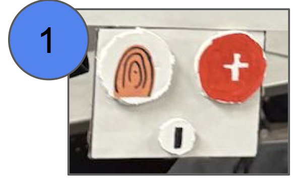
Iteration 1: a large red plus button next to the fingerprint Start button
1 · A red “+” sets the destination to the nearest hospital.
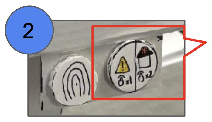
Iteration 2: one button labeled tap once for hazard lights, twice for the hospital
2 · One button: tap once for hazard lights, twice to contact the hospital.
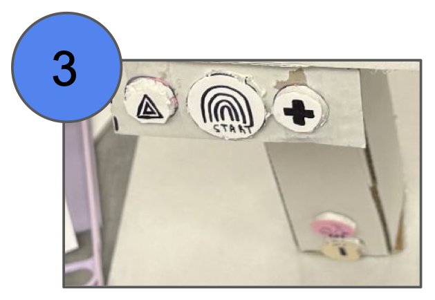
Iteration 3: separate hazard and emergency buttons beside the Start button
3 · Separate hazard-light and EMS buttons, plus an SOS button on the column for customer support.
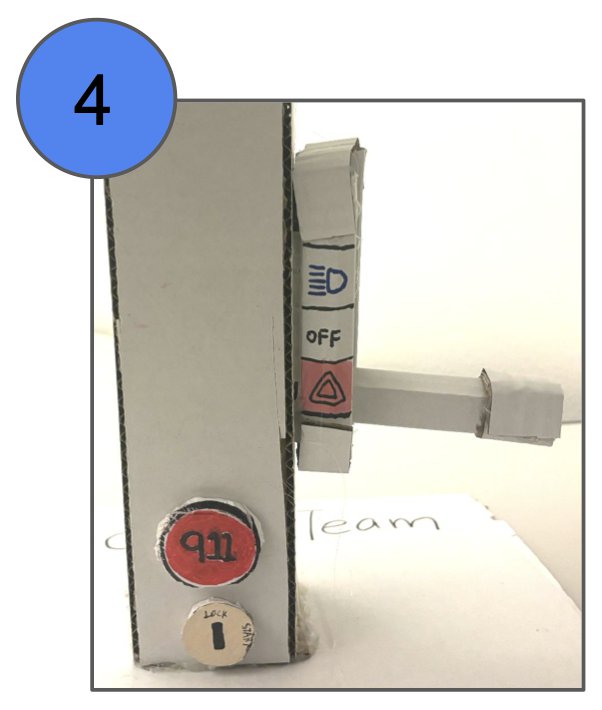
Iteration 4: side control panel with light switches and a red 911 button
4 · Final: a red 911 button contacts EMS; hazard lights move to a toggle.

Key decision 2: getting help in an emergency

Given Rose’s age and disability, we wanted a physical way to reach help. We first assumed it should be big and prominent. Testing showed people weren’t sure what the button did, why something used so rarely was so prominent, and why it sat next to the controls that started the vehicle.

Over four iterations we split and relabeled the controls. The final panel has a red 911 button that contacts emergency services and a separate toggle for the lights, including hazard lights. Red and clear icons carry the meaning, and the 911 button sits away from the main screen so it isn’t pressed by mistake.

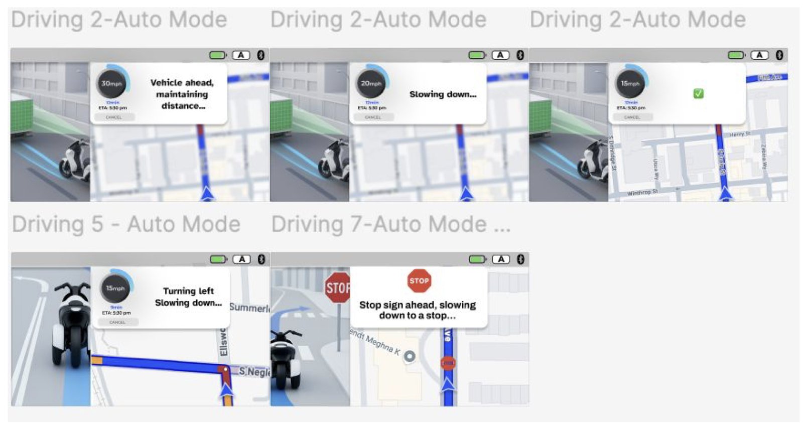
Five auto-mode dashboard screens with a 3D view of the moped and prompts such as vehicle ahead, maintaining distance; slowing down; turning left; stop sign ahead
Auto mode: a 3D view of the moped and short prompts about what it is doing.

Making auto mode easy to read

In auto mode the moped manages speed, distance and navigation, and its speed and direction can change without Rose doing anything. So the dashboard keeps telling her what it’s doing.

A 3D view on the left shows the moped and the traffic around it. Short prompts in the corner say what the vehicle is doing: “Vehicle ahead, maintaining distance…”, “Slowing down…”, “Turning left, slowing down…”, “Stop sign ahead, slowing to a stop…”. Enough to keep her informed, never enough to distract her.

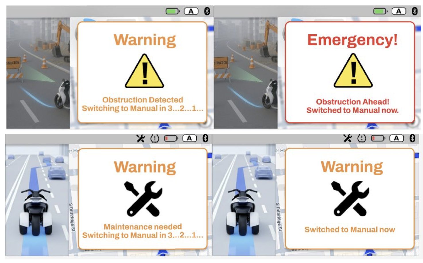
Four warning screens: an obstruction warning with a triangle icon counting down to manual mode, an emergency warning, and maintenance warnings with a wrench icon
Handover warnings: obstruction (triangle) and maintenance (wrench), each with a countdown to manual mode.

Handing control back

When the vehicle meets something it can’t handle, such as an obstruction ahead or a maintenance fault, it switches back to manual.

A large warning appears at the center of the dashboard in high-contrast orange or red. A triangle or wrench icon says what kind of problem it is, and a countdown tells Rose when she will be driving again.

RiderSystem
Obstacle detected: the vehicle alerts Rose to an emergency
Rose cancels auto mode and steers around it
Brake triggers, vehicle slows
Rose does nothing
Brake triggers automatically
Obstacle avoided?
Yes ↓
Rose keeps riding
No ↓
Vehicle contacts EMS with her location
Rose is told help is on the way
Redrawn from our team’s task flow: an emergency during auto mode.

And if she doesn’t respond?

We mapped that path too. If Rose takes over, she steers around the obstacle while the vehicle brakes. If she does nothing, the brake triggers automatically.

If the obstacle still isn’t avoided, the vehicle contacts emergency services with her location and tells her help is on the way.

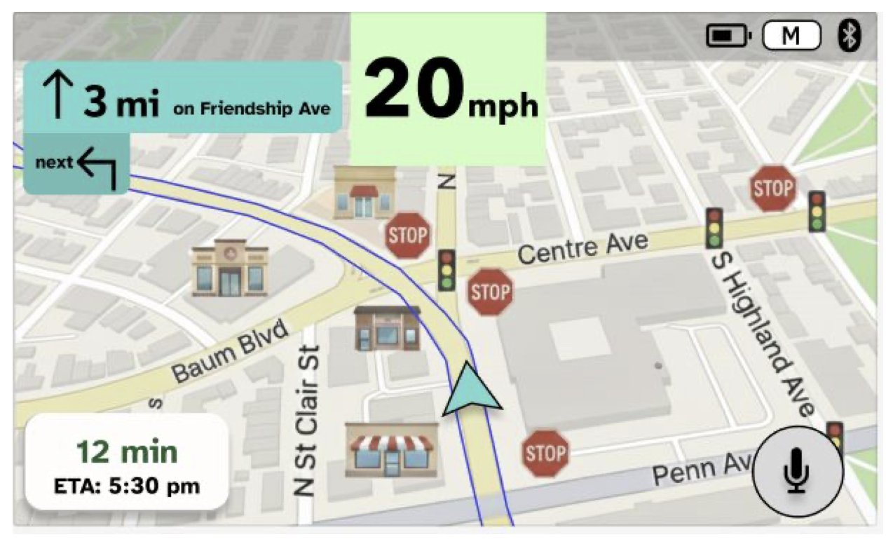
Mid-fidelity navigation screen with a microphone button in the lower right
Before: mid-fidelity, with a microphone button.
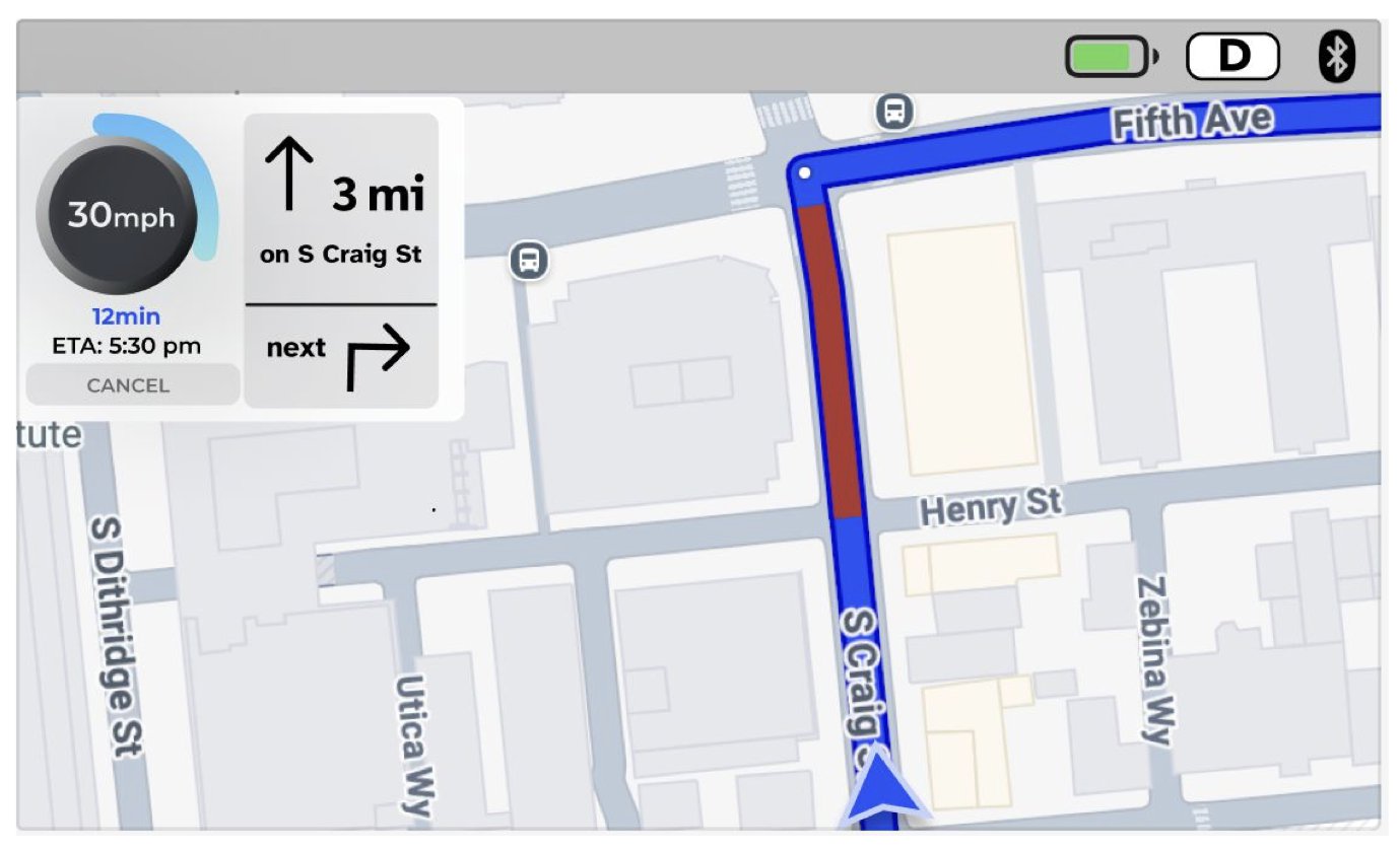
High-fidelity navigation screen without the microphone button
After: high fidelity, focused on driving.

Cutting what nobody used

Our mid-fidelity navigation screen had a microphone button so Rose could call for help or ask for assistance.

In testing, no participant noticed or used it, and we couldn’t find a clear, high-value use for it. We removed it in high fidelity to keep the screen focused on driving.

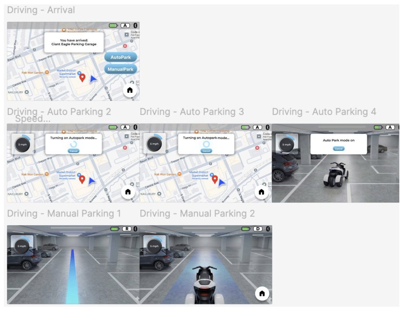
Arrival and parking screens: an arrival message with AutoPark and ManualPark options, AutoPark progress, and a camera view with a blue guide line
Arrival: AutoPark or ManualPark.

Arrival: park it yourself, or let it park

At the destination, the dashboard offers AutoPark and ManualPark. With AutoPark, the moped steers, brakes and positions itself while the screen keeps showing the map and speed.

With ManualPark, Rose shifts between drive, reverse and park on the gear ring, and a blue guide line on the ground helps her line up with the space.

1
Problem framing is the hard partOur two How-Might-We questions took a full class session. Next time I would cluster insights and test several phrasings before committing to one.
2
Don’t project your own mental modelWe were sure riders would spot the auto-mode control. None of the six did.
3
Test whether people can find a controlWhether a control can be found has to be tested with real people. That finding reshaped our whole mode-switching design.

What I learned

The hardest part of this project wasn’t the interface. It was deciding what problem we were solving, and then letting testing overrule what felt obvious to us.