Product Design · CMU Course Project
Hive Five: Group Meetups for Bumble BFF
The brief asked for “nearby like” notifications that nudge free users to upgrade. The course data and the real problem on BFF pointed somewhere else: matches that never turn into a meetup. Hive Five books a table for five people with shared interests. An individual project in Advanced Interaction Design at Carnegie Mellon, Spring 2026; a concept, not affiliated with Bumble.
- Course
 Advanced Interaction Design · Carnegie Mellon · Spring 2026
- Team
- Individual project
- Deliverables
- iOS flows · Notifications, Apple Watch and Android · Web entry point · Concept pitch
- My role
- Research and reframing · Data analysis · Interaction and visual design · Figma design system
Project outcomes
A brief tells you what to build. It doesn’t always tell you what problem is worth solving.
This project was about taking a growth brief seriously, then using its own data and a closer look at the users to redirect it toward something people would actually show up for.
Brief and data
01 / 04The brief: turn a nearby like into an upgrade
The course brief cast me as the designer on a Bumble customer-acquisition team. Free users rarely have a “now” reason to upgrade. A like from someone close by was meant to be that reason: high intent, relevant, and spontaneous, with Premium revealing who it was. The target was 12% of exposed free users upgrading within seven days, with guardrails on blocks, reports, and location opt-outs, and designs for mobile, desktop and watch.
The brief also came with a dataset: conversion, retention and adoption figures for two location features, Proximity Alert and Map Integration, split by Bumble’s three modes. It was course-provided, not real Bumble data, but it was the evidence I had, so I started there.
The data pointed away from dating
I had assumed dating would convert best and planned to design there. Friends mode led both experiments instead. It was the lowest-risk, highest-confidence place to introduce a paid feature, so I moved the whole project to Bumble BFF.
Concept and reframe
02 / 04First concept: a map of friends nearby
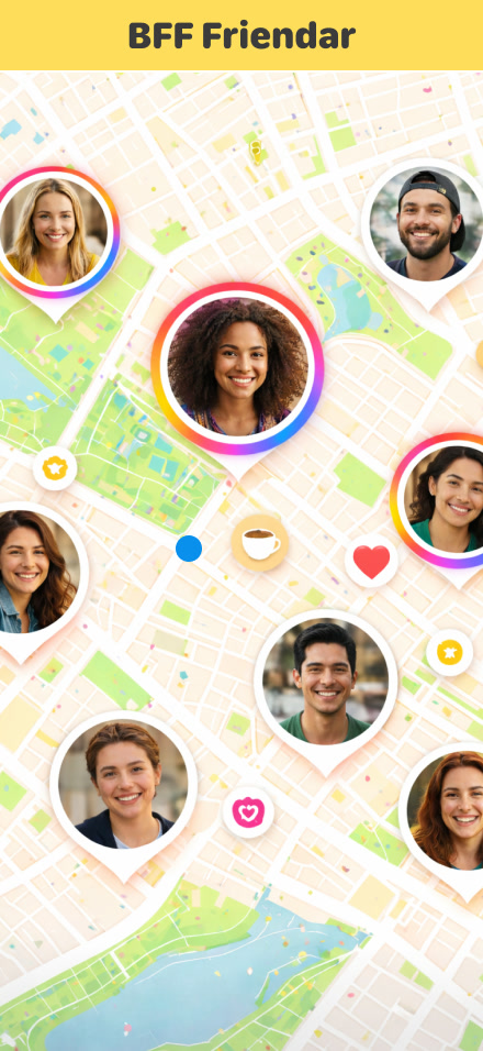
My concept pitch followed the brief closely. Emily has a few BFF matches but has never met any of them; they live too far apart to make plans. One day a nudge tells her friends are nearby, Premium shows her where, and she sees Ashley at a coffee shop around the corner. She messages Ashley, and they meet.
The pitch tied it back to the business goal: a premium moment with high intent, clear value and low risk for conversion, and a repeatable loop for retention.
Why I didn’t build it
Walking through realistic scenarios broke the idea. The brief said nothing about what happens when the nudge arrives while you are in a meeting or on an errand and can’t get away, and every such case needed its own screen. Showing live locations in a friends product also raised exactly the safety stakes the brief warned about.
Underneath that was a problem the alert never touched. In AI-assisted desk research on BFF complaints, and in my own experience with social apps, the same theme kept surfacing: matches don’t turn into plans, and most conversations fade out. Distance wasn’t the blocker. The missing step was a concrete plan.
So I kept the business goal and replaced the mechanism. Instead of selling a signal about who is nearby, sell a seat at a table: five people with similar interests, a time, a neighborhood, and a venue that is already booked.
- 01The product’s job ends when people meet
Every screen exists to get five people to the same place at the same time, then get out of the way.
- 02Sell the seat, not the signal
Premium unlocks a booked event with a clear reason to pay now, instead of a hint that needs a reveal.
- 03Safety by default
No live location. Who else is coming stays hidden until the event has happened.
Final design
03 / 04Five people, one plan, no swiping
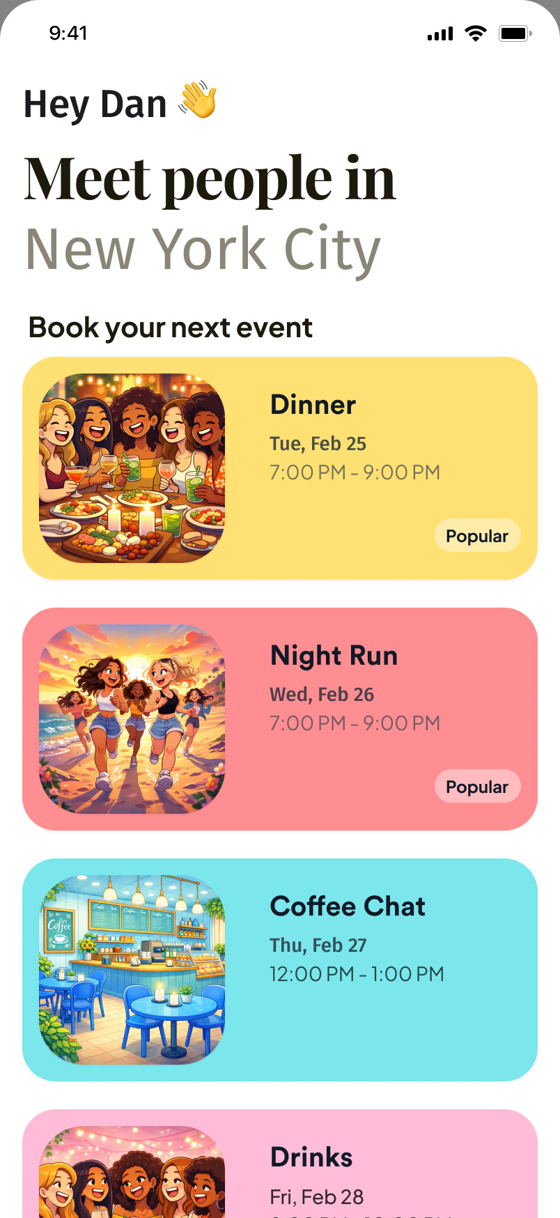
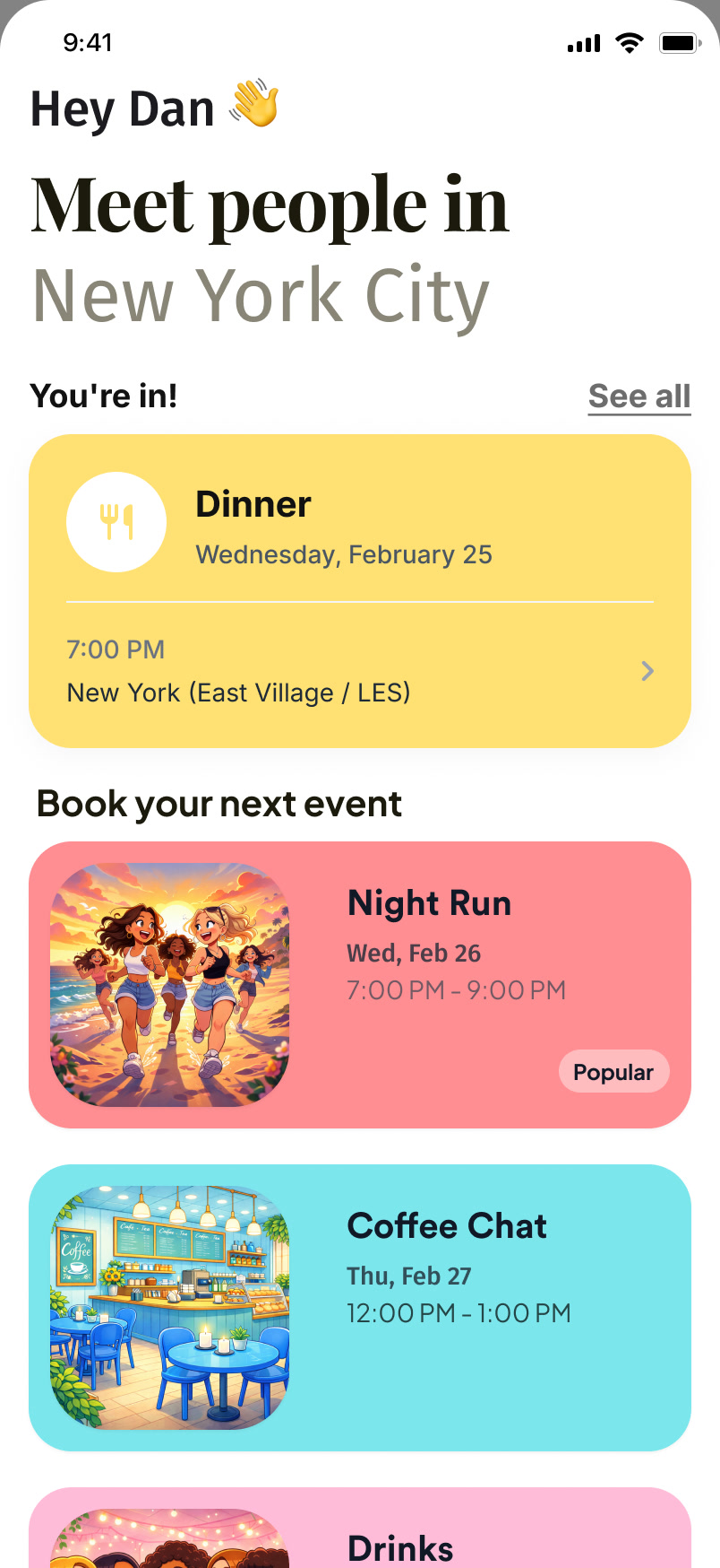
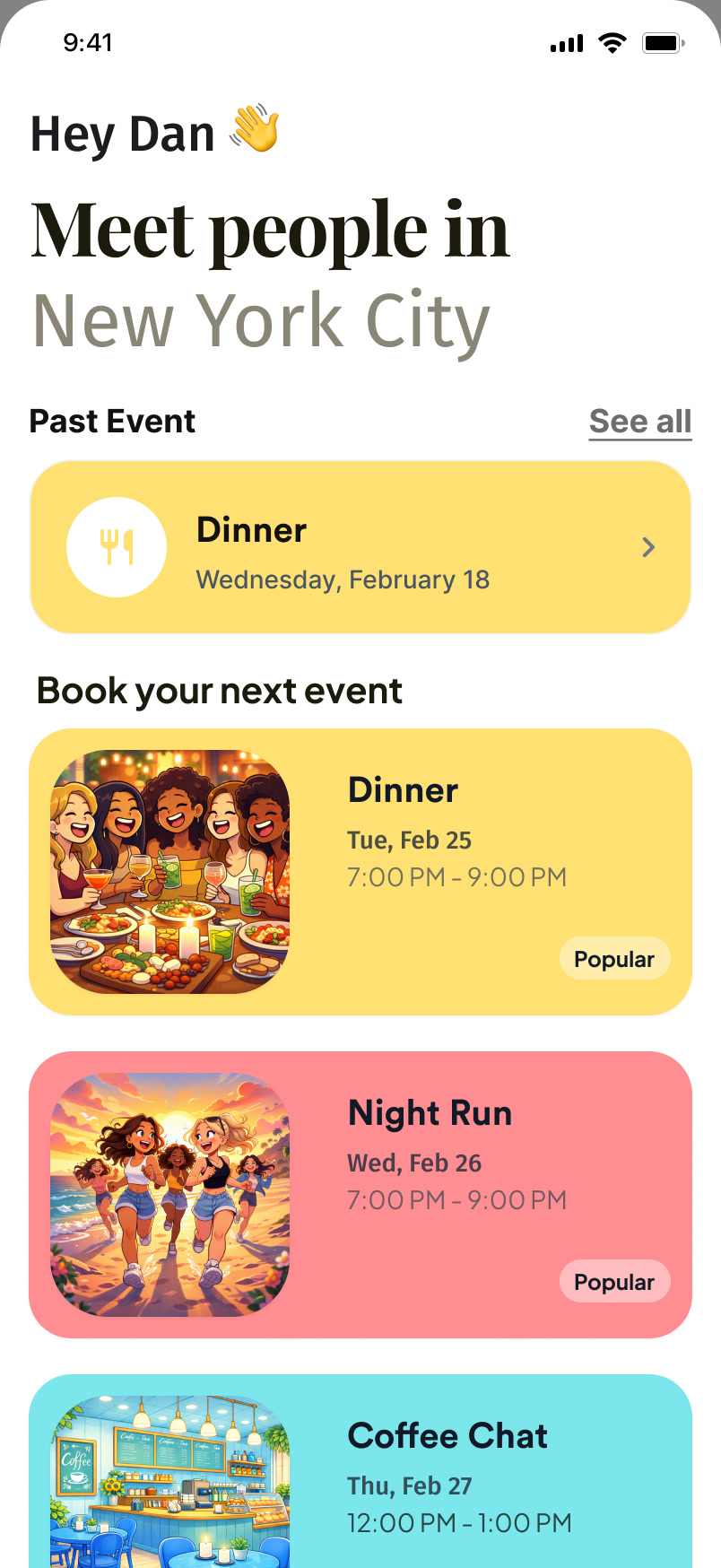
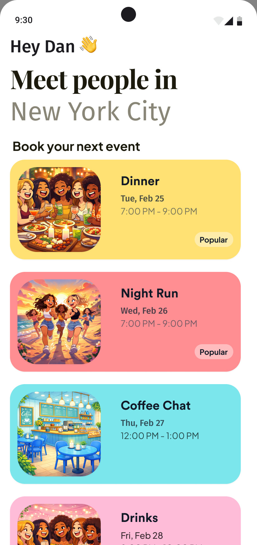
Hive Five lives in the People tab. The home page is a list of this week’s events in your city, each with a type, a date and a time: Dinner, Night Run, Coffee Chat, Drinks, Hike, Brunch. There is nothing to swipe and nobody to evaluate; you pick an evening.
The same page carries your commitments. Once you book, “You’re in!” sits above the list with the date and neighborhood; after the event it moves to “Past Event”, where the group is waiting.
Booking takes three answers
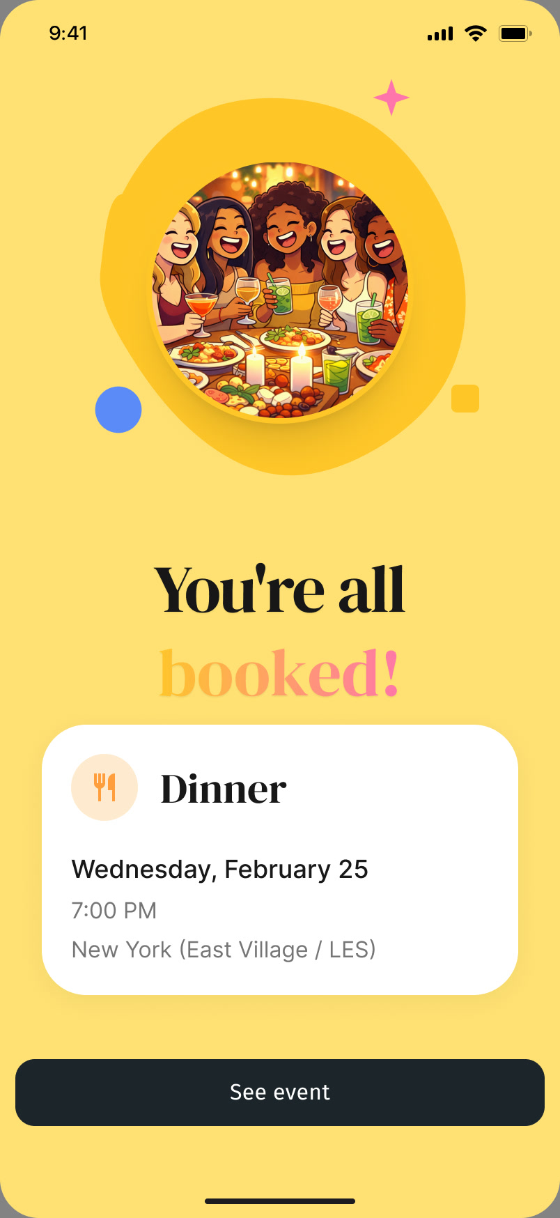
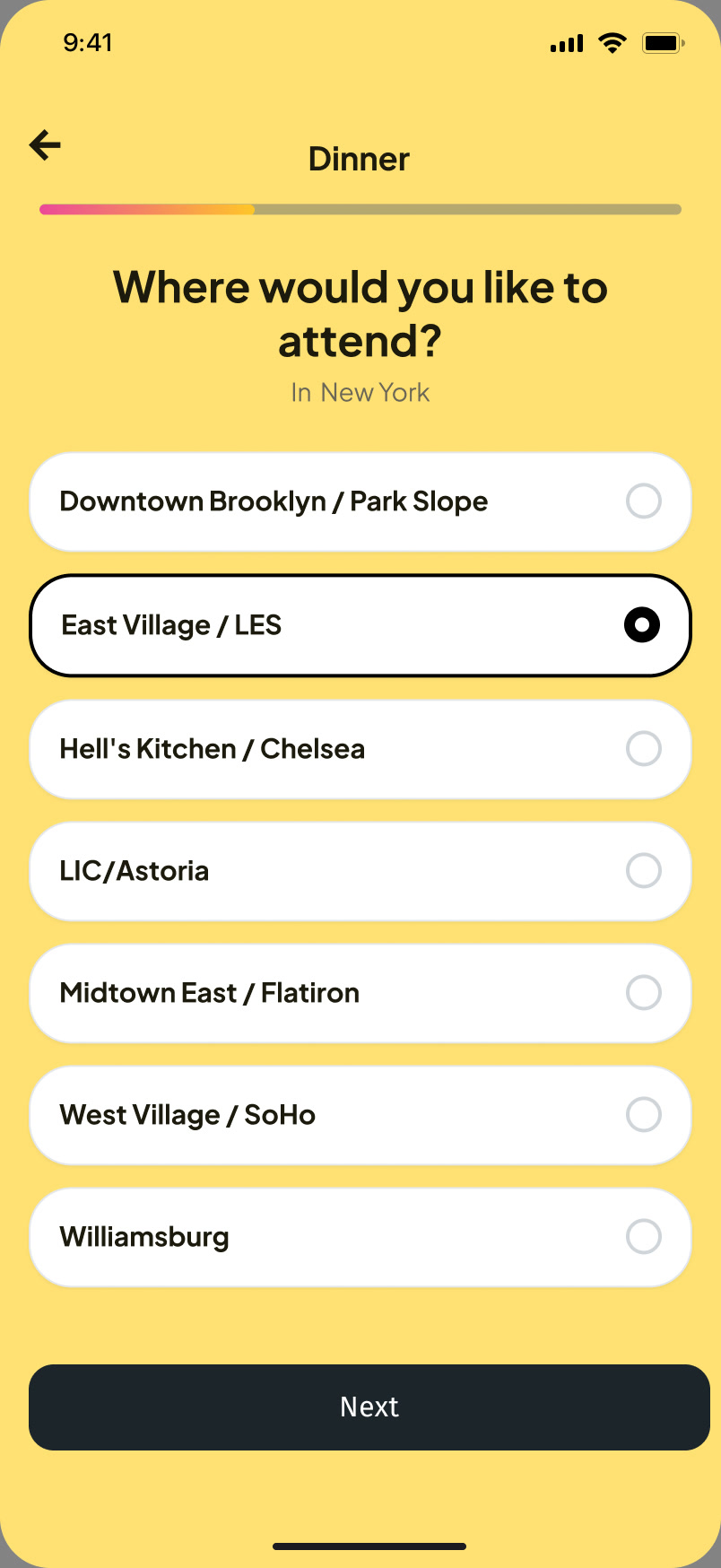
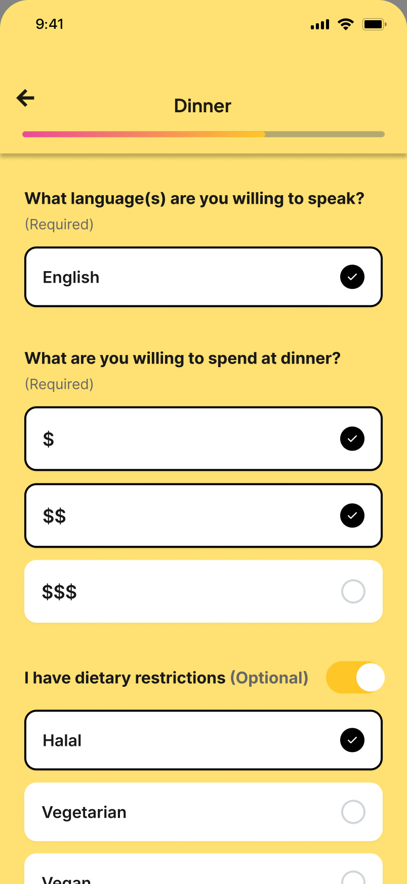
Signing up asks only what the matching needs: which part of the city, which languages you are happy to speak, what you would spend, and any dietary restrictions. A review step shows the summary before you confirm, and the confirmation is a single screen: “You’re all booked!”, with the date, the time and the neighborhood. The venue and the group come later.
Free to browse, premium to sit down
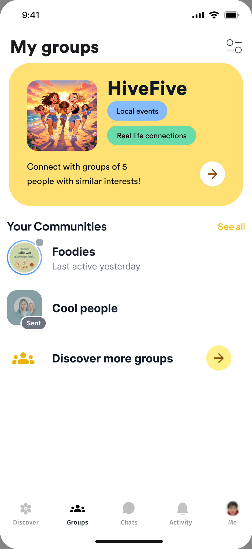
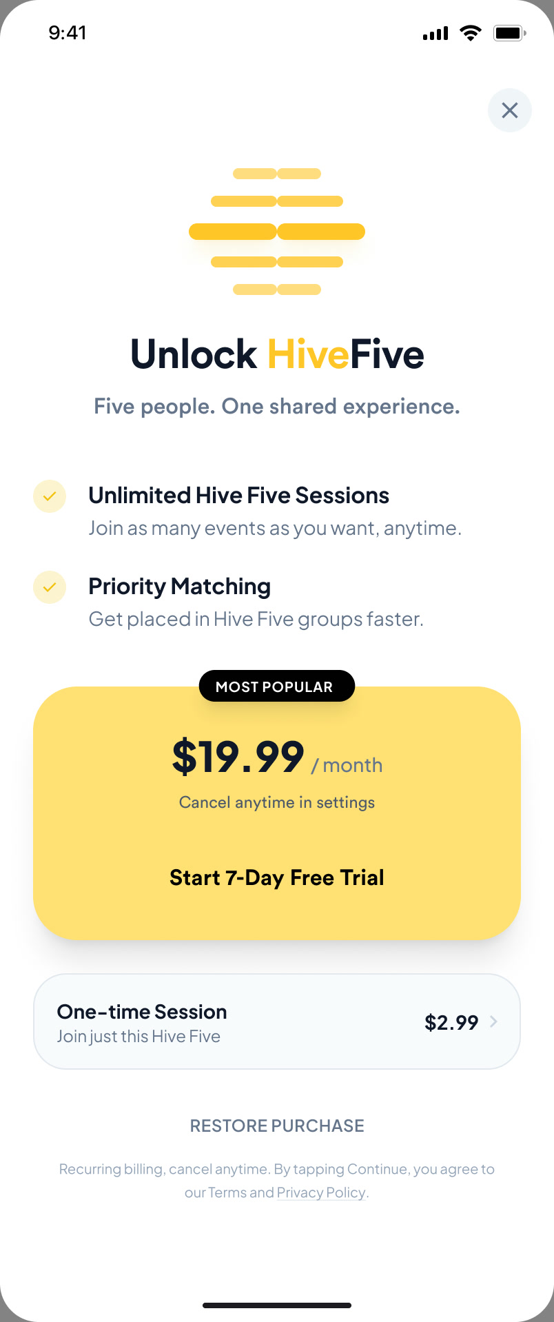
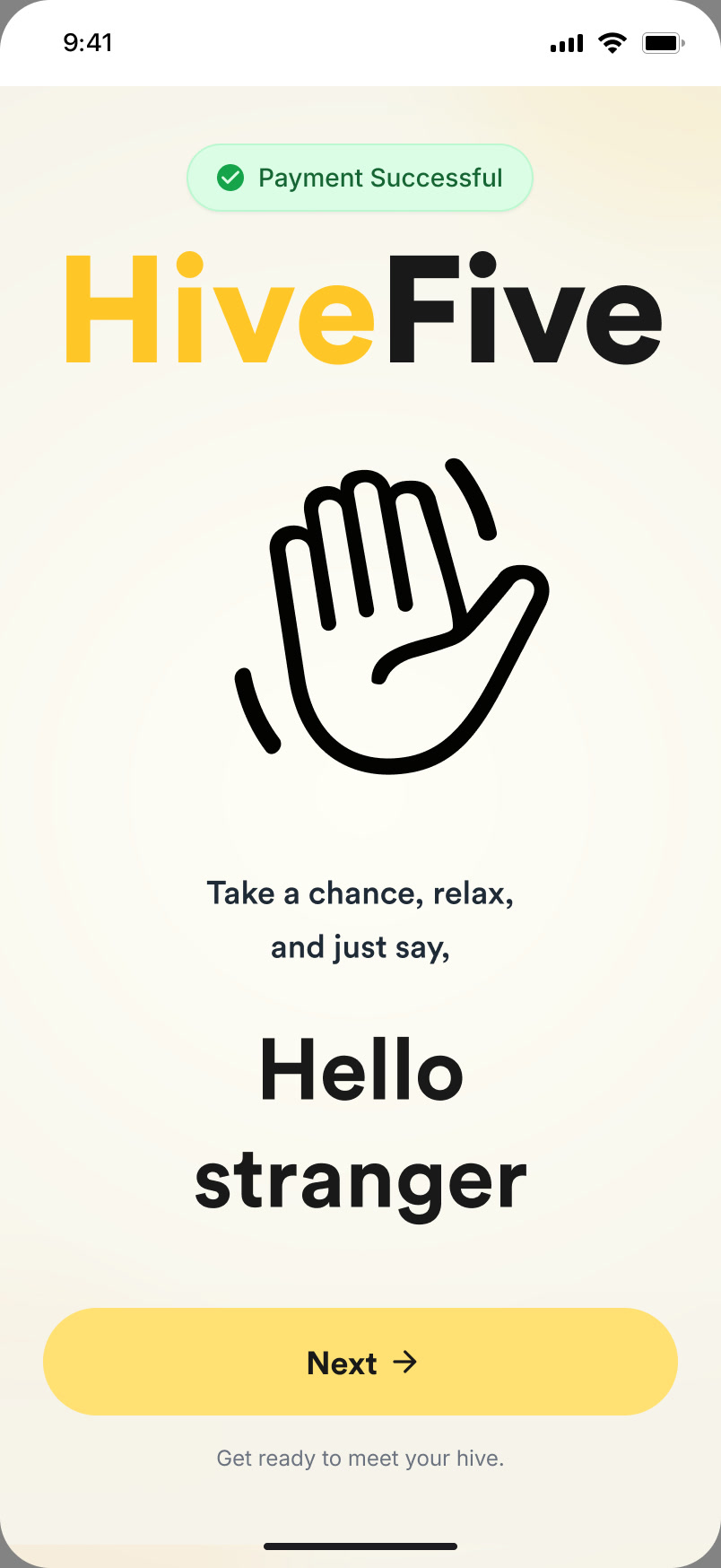
Free users meet Hive Five as a card in My groups and can read what it is. The paywall appears at the point of highest intent, when they want a seat: a monthly plan with a seven-day trial for unlimited sessions and priority matching, or a one-time session for a single event, so the first dinner doesn’t require a subscription. A short welcome sets the tone before the first booking: “Take a chance, relax, and just say, Hello stranger.”
An event page that changes with time
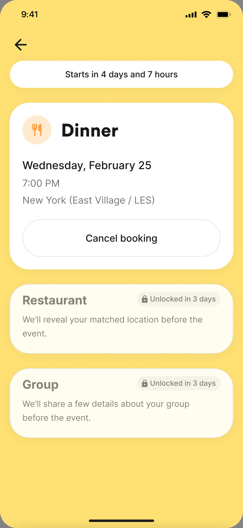
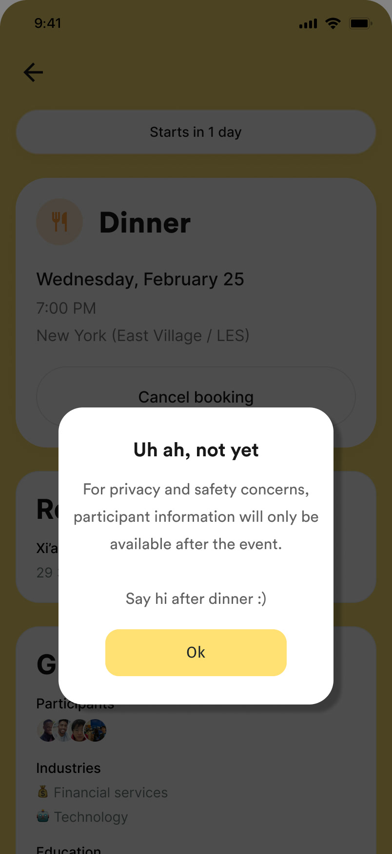
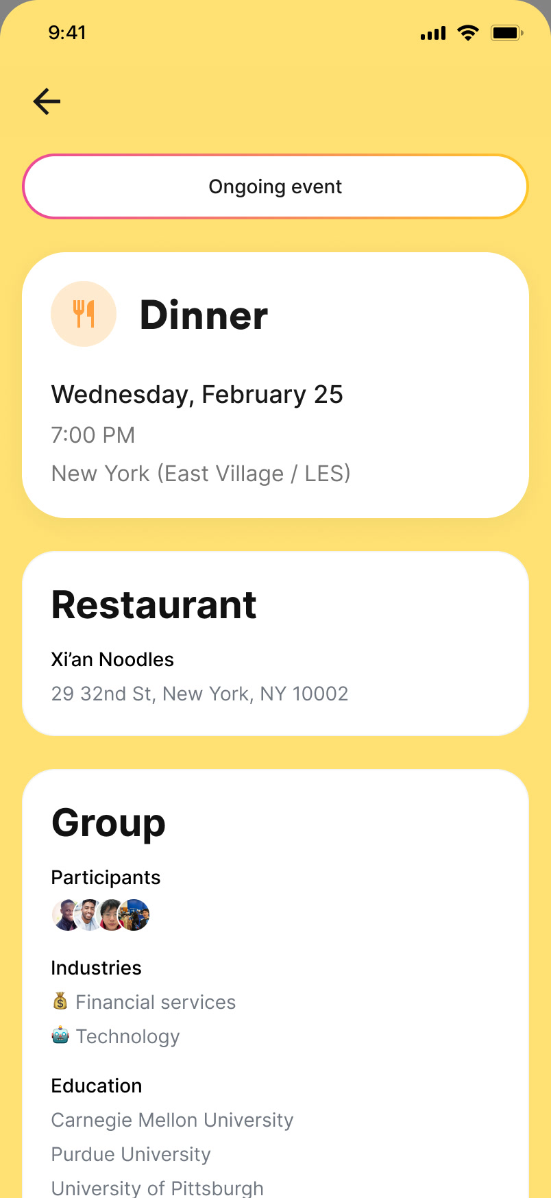
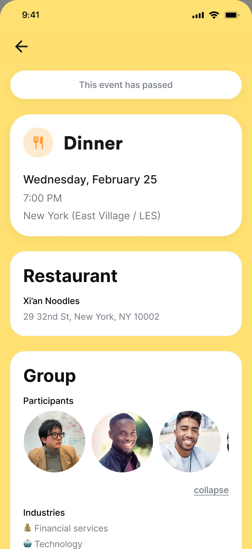
One event page carries the whole lifecycle. Before the event, a banner counts down (“Starts in 4 days and 7 hours”, then “Starts in 1 day”). Three days out, the restaurant unlocks, along with a sketch of the group: its industries, schools and nationalities, but not who they are. During the event the banner reads “Ongoing event”. Afterwards it reads “This event has passed”, and the people appear.
Two dialogs do the guarding. Cancelling is allowed, but the page says plainly that you lose your spot. Tapping the participants early gets a “not yet”: for privacy and safety, who else is coming is only shown after the event. Say hi after dinner.
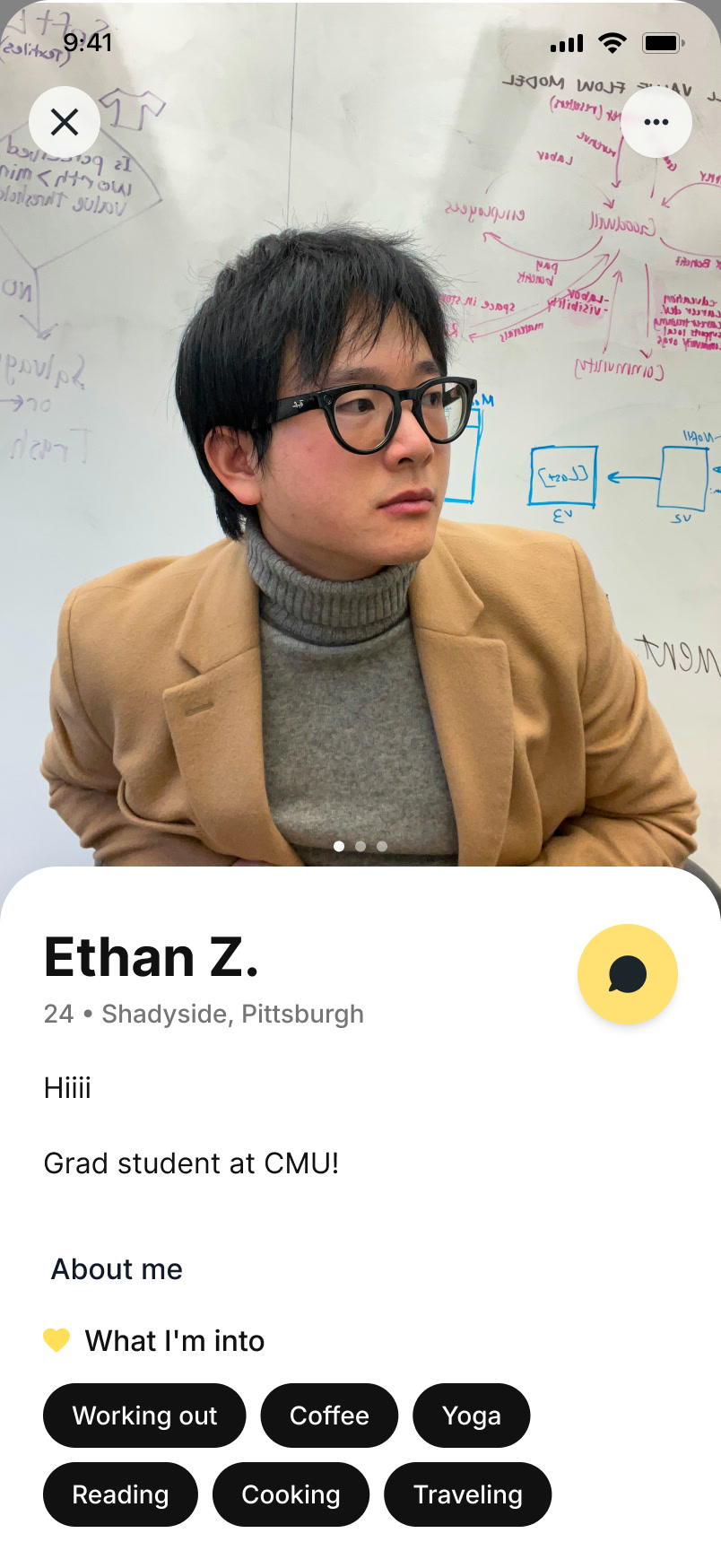
After the night, a way to stay in touch
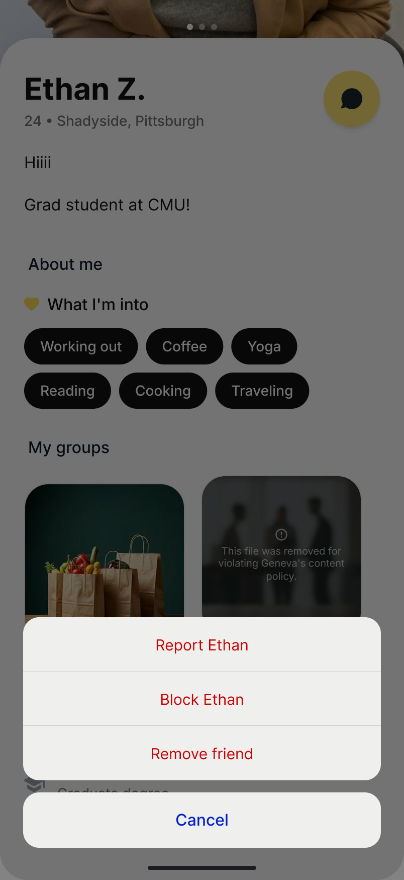
Once the event has passed, the page shows who was at the table, and each participant becomes a profile: a photo, a short bio, what they are into, the groups they belong to. A message button keeps the conversation going with people you have already met.
The same sheet that lets you message someone lets you report or block them. Meeting in person first lowers the risk; the controls are there for the rest.
Notifications that follow the plan
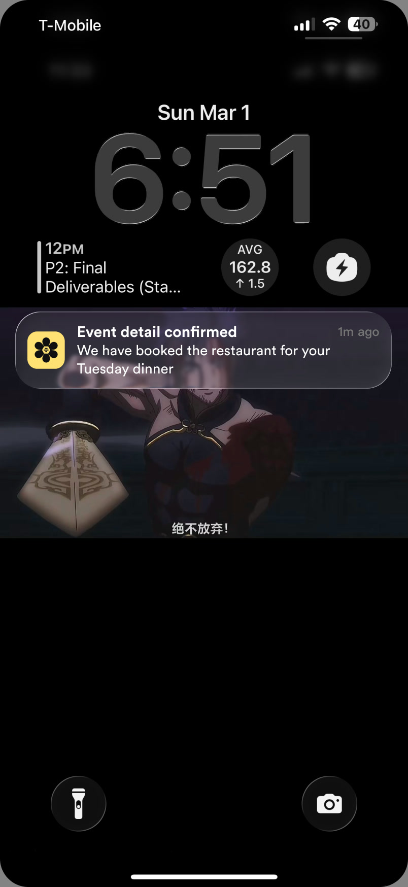
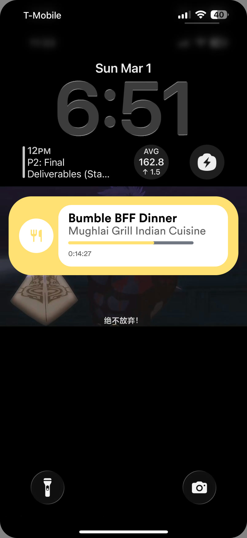
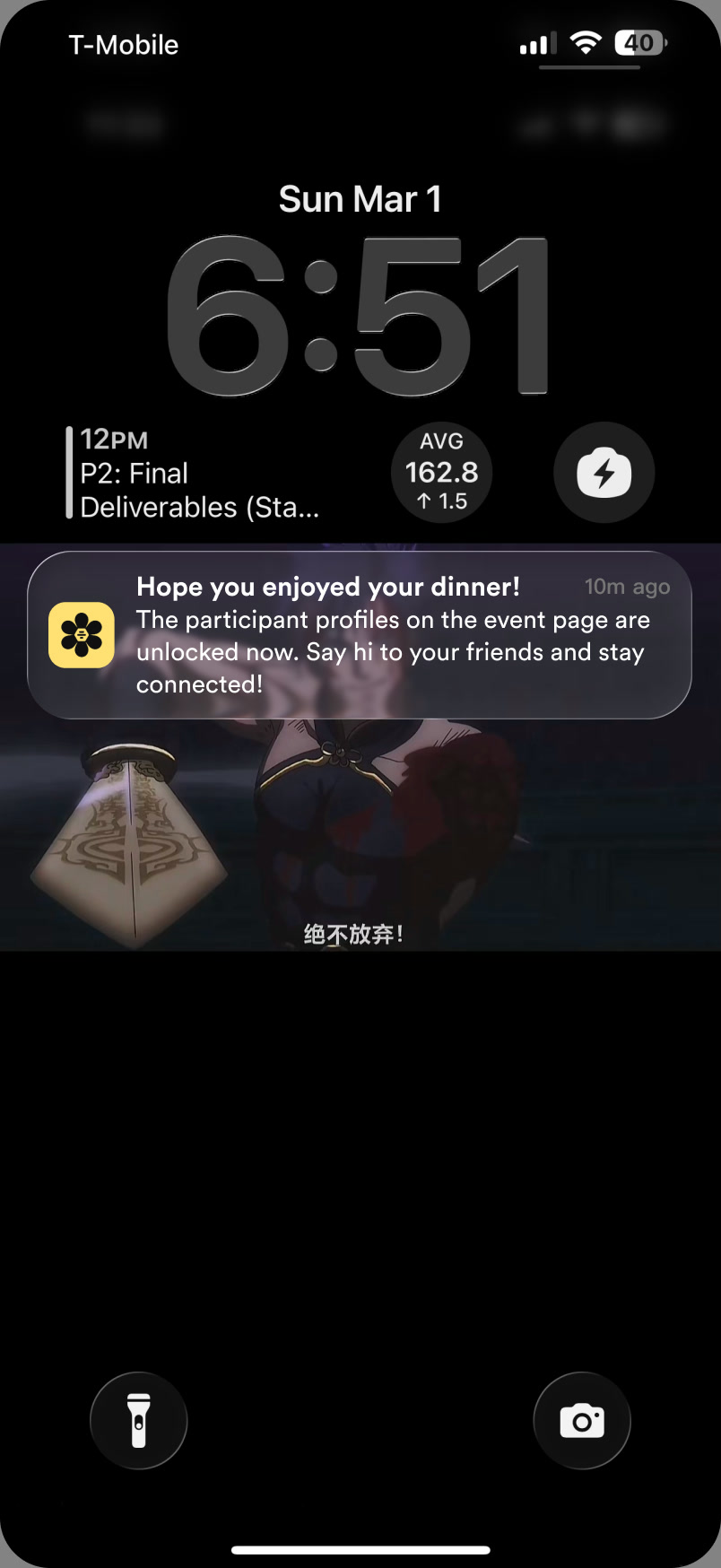
The brief was about notifications, and Hive Five still needs them, but each one is tied to a step of the plan rather than to someone’s location. A confirmation says the restaurant has been booked. A Live Activity on the lock screen keeps the venue and the time in view while the event is on. Afterwards, one message says the profiles are unlocked.
Apple Watch: only what is time-sensitive
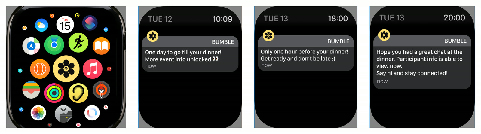
Bumble BFF has no Apple Watch app, and Hive Five doesn’t need one. What belongs on the wrist is the handful of alerts that matter at a specific moment: the event is tomorrow, more details are unlocked, the restaurant is confirmed.
Android, and a deliberate no to desktop
The Android version keeps the same design and adapts only what the platform changes: device sizes and the status bar.
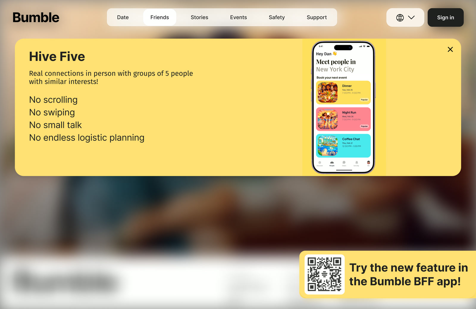
The brief asked for desktop too, and I decided against it. BFF has no web product, and the feature depends on phone capabilities such as instant notifications. What the web does have is a marketing page for BFF, so I added a Hive Five entry to its Friends tab: a short pitch and a QR code that opens the feature in the app.
Reflection
04 / 04What I learned
The concept was reviewed in two rounds of peer critique and presented at the end of February. It was not tested with BFF users, so what I can claim is the reasoning, not the results. The next step would be to test the sign-up and the hidden-participants rule with real BFF users, then A/B the paywall framing.
- 01Reframe before you draw
Following the brief as written would have meant designing edge cases for a feature that didn’t solve the real problem. Reframing cut the work and made the solution cleaner.
- 02Data sets the direction, judgment sets the details
The dataset changed which product I designed. The interaction decisions came from critique and product judgment, which is where testing and A/B experiments come in later.
- 03My first pass was AI-generated, and it showed
Before the first critique I generated the screens with AI. Next to my classmates’ hand-crafted work they looked generic: predictable patterns, overused gradients, nothing of Bumble in them. I kept AI for small components and designed every screen by studying how Bumble’s own app actually works.
- 04Not everything needs to be a component
I started by making everything a component, including the phone frame. A design system pays off in variants and states once the product grows; before that it is overhead.